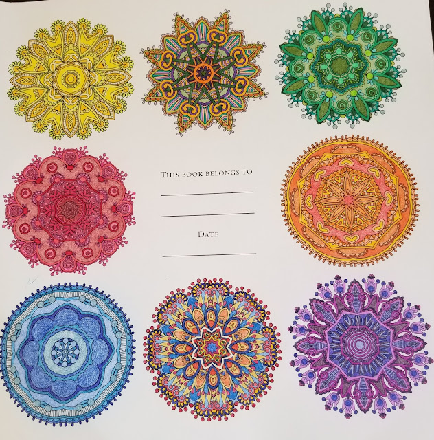
They are supposed to be soothing and meditative as a project to color regardless of the reason you take up this activity. To be honest, whenever I've looked at books of mandala's in the past I found them pretty, but also they didn't speak to me....I felt like they were too busy, or frustrating to color.
When I picked up this book, I actually found the pictures to be relatively less busy, and so I thought, Ok I'll take this home, and review it for those that might be interested in mandalas. There were a TON of lead in pages, including the cover, which for once, I did NOT color LOL, I used that as a color test page since I did not see one in the book. There are numerous artists, listed in the back of the book.
This book is double sided and I would suggest putting paper in between colored as well as a few pages behind what you are coloring to preserve the integrity of the art and your creativity. I can always download an example of bleed through coloring or rather bleed OVER on one of the lead in pages if necessary, but I think people understand what I mean by this. The bleed over occurred when I was doing one of the actual pages, it'll be the one I did in greys. I used warm, cool, and french versions which to me seem a bit on the brown side. I think some will realize on one lead in page I did primary and secondary colors as well as a mandala with all the primarys, blue,red and yellow, and one with all the secondary colors as well purple, green and orange.
The paper is nice and heavy, and takes light colors well as well as layering for darker colors. I have examples of each since there were so many lead in pages. I would definitely be careful to preserve the integrity of the art if using water colors or markers, but I think gel would be ok without bleed through. I didn't feel like thinking about colors, so I decided to try a new thing....using my prismacolor set in order....mostly....of the numbers, minus the black and browns on the 2 lead in pages and the one that I did in heavier colors. Even minus the blacks and browns it took all three pages to get to the end of the colors, though to be fair, one of the lead in pages had very little to color.
I actually did the same on the grey page, but ran out of the grey greys and included green greys, blue greys etc at the end. The only difference on that one is, I began with the 90% colors in each warm, cool and french and worked my way out to the 10%s before I moved on to include the extra greys in other colors.
All in all, I did have fun doing these, although some were so involved that they did take me a while to color. I'll begin with the cover and then share the lead in pages in order so you can see how the book begins.....if you're as anal as me about doing things in order, you're likely to need to begin the same way.
I hope this gives you a good idea of Mandalas and if they might be a good project for you! As always I look forward to seeing your art and input as well, enjoy!


No comments:
Post a Comment